Posts

Magazine plan

Image
 Name: Flicks Sub-genre: independent/ mainstream Target audience: 16-24 year olds, media literate, casual film watchers  Films: Barbie - how inclusive was it? Cover lines: Possible photoshoot idea: Studio- pink background  SECTION HEADINGS IDEAS: This Issue  Teasers  Features  In cinemas  Reviews  IMDb: Articles: Elemental Pixar brings fire, water, air and earth to your screens with new movie Elemental. Harrison Ford Will Indiana's last adventure be his greatest? Oppenheimer Christopher Nolan is back with a brand new thriller. Dune: Part Two We're going back to Arrakis with the sensational stars Timothee Chalamet and Zendaya. The Nun 2: The demon Valak will return to haunt the next instalment in 'The Conjuring' universe Meg 2: The Trench Bringing the giant, bloody shark back to our cinema screens. Trolls Band Together Princess Poppy and Branch finally make it official. Spider-Man: Beyond the Spider-Verse Tom Holland comments on the animated sequel of 'Across the Sp

Research: codes and conventions (sight and sound)

Image
 COVER ANALYSIS: Masthead: The colour of the masthead seems to be totally different to the main image which is not typical. They take a colour which is contrasting to the main image so that it stands out and even use this same colour for some of the extra text featured too. The main image does not typically overlap the masthead this may be because they are an independent brand so are not as recognisable as some other big film magazines, so the whole masthead needs to be seen. Main image: The person featuring on the main image is usually looking into the camera giving the audience direct address making them feel more connected with the magazine. As an independent brand this decision is important because it shows the audience that the magazine care and want the audiences attention, which is important for an independent brand. Target audience: Aimed at educated adult readers, who are interested in films, critical analysis of films and see's films as art. Coverlines: Usually the same c

Research: codes and conventions (total film)

Image
  \ Colour palette:  based off of the main image colours  Target audience: 18-34 predominantly male cinema enthusiasts. People who enjoy films or show interest in films and who will recognise the characters/actors - more likely to purchase the magazine. Main image: in the middle of the front cover, person is looking at the camera or slightly off to the side like they are looking into the distance. Masthead: Large, bold font normally basic shade colours like black, white and grey so that it stands out differently from the main colour scheme of the cover. The main image is typically overlapping the masthead, this decision could have been made as they feel their masthead is fairly recognisable and people would not have trouble noticing what brand it is. It could also be to show that the main focal point is on the main cover image  Coverlines:  the cover lines are placed around the main image in two main colours white and red or orange and white, the main cover line is placed on the bottom

Research: codes and conventions (Empire)

Image
Empire front covers: Colour palette the choice of colour palette in Empire magazines is based off of the main image, there are typically 3 colours. Masthead:  the colour of the masthead is chosen in contrast to the main colour scheme usually, black or white. It is in large bold font so it stands out from the rest of the cover. The main image is typically overlapping the masthead, this decision could have been made as they feel their masthead is fairly recognisable and people would not have trouble noticing what brand it is. It could also be to show that the main focal point is on the main cover image   Main image: the main image takes up the majority of the page, and the people starring are usually staring directly into the camera or just past the camera. The main image usually features an actor from the film, sometimes in costume, so that people will recognise them.  the people int the front cover are represented as brave and powerful in their costumes. Coverlines:  the cover lines ar

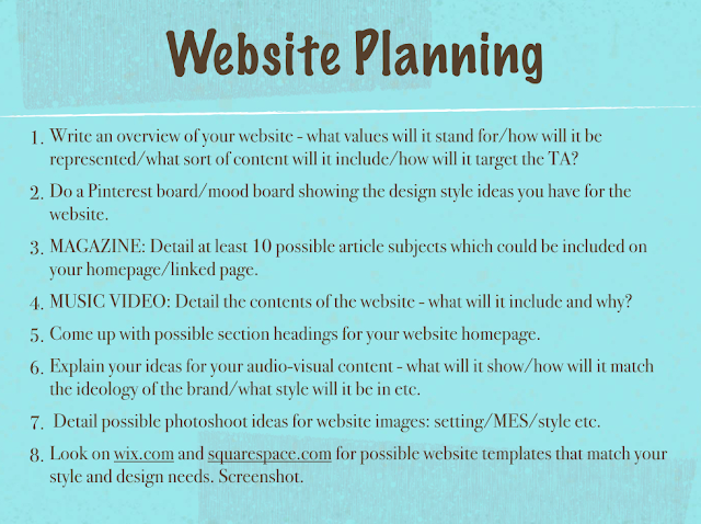
Website Plan

Image
 Name:  Flix Sub-genre:  independent/mainstream Target audience:  16-24 year olds, media literate, casual film watchers  Articles: Elemental Pixar brings fire, water, air and earth to your screens with new movie Elemental. Harrison Ford Will Indiana's last adventure be his greatest? Oppenheimer Christopher Nolan is back with a brand new thriller. Dune: Part Two We're going back to Arrakis with the sensational stars Timothee Chalamet and Zendaya. The Nun 2: The demon Valak will return to haunt the next instalment in 'The Conjuring' universe Meg 2: The Trench Bringing the giant, bloody shark back to our cinema screens. Trolls Band Together Princess Poppy and Branch finally make it official. Spider-Man: Beyond the Spider-Verse Tom Holland comments on the animated sequel of 'Across the Spider-Verse'. Snow White   Casting controversy over Latina actress Rachel Zegler. Ballerina A young female assassin seeks revenge against the people who killed her family. ⬆️from mag