Research: codes and conventions (sight and sound)
COVER ANALYSIS:


Masthead:
The colour of the masthead seems to be totally different to the main image which is not typical. They take a colour which is contrasting to the main image so that it stands out and even use this same colour for some of the extra text featured too. The main image does not typically overlap the masthead this may be because they are an independent brand so are not as recognisable as some other big film magazines, so the whole masthead needs to be seen.
Main image:
The person featuring on the main image is usually looking into the camera giving the audience direct address making them feel more connected with the magazine. As an independent brand this decision is important because it shows the audience that the magazine care and want the audiences attention, which is important for an independent brand.
Target audience:
Aimed at educated adult readers, who are interested in films, critical analysis of films and see's films as art.
Coverlines:
Usually the same colour as the masthead which draws the audiences attention to the bottom of the cover as well as the top. Main cover line usually in a big, bold font standing out from the main image and the rest of the cover lines. The content of the cover lines are usually based on who is starring as the main image, they tend to focus on the left hand side and the bottom of the page.
Colour palette:
The colour scheme of the background depends on the vibrancy of the main image.
CONTENTS PAGES:


The main image has white writing overlapping it with a large page number also written on it, we can assume these are linked and the image gives us insight into what that page is about. Beneath the main image are 3 other articles featured in the magazine with their page numbers clearly marked above the writing. The choice to only feature 3-4 articles on the contents page is unusual and shows that they must be confident in their main stories to entice readers to buy the issue.
All of the colour is on the main image and does not extend further than that, the rest of the writing and background is in black and white which really focuses all of our attention on the main image and article.
The title is found at the top of the page so the audience can easily tell which page they are on. However the font is quite small and not in bold
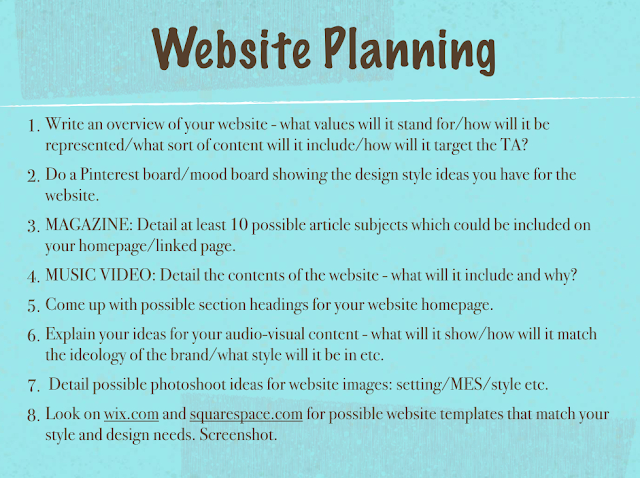
WEBSITE:


Comments
Post a Comment